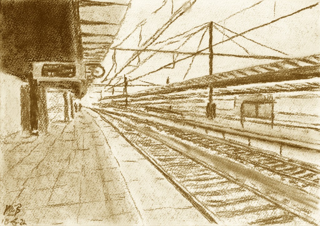
Bruges is well known for its pretty old buildings and canals. However, few who have visited the city other than by train will realise just how modern by comparison the station is. Of course the station is not brand new – rather it is modernist, with lines that are very straight and clean, the building realised in steel, concrete and glass.
Initially I thought that this view would work best in black and white – the photo I had taken whilst waiting for a train there certainly looked cooler in monochrome than in colour. However, rather on a whim, I decided to use charcoal rather than pencil for the drawing. This made achieving sharp clean lines rather difficult, but as always was a help in reducing the amount of extraneous detail I was tempted to include. In the end the platform in the drawing didn’t have the “shininess” of the platform in the photo, which rather changed the feel of the picture. However, whilst I was playing around with the colour temperature and contrast of the scanned image to see if I could improve things a bit, I serendipitously hit a sepia effect button and rather liked the result. So there we have it – an artificially aged (i.e. sepia) drawing of a modern(ist) building in a place famed for being old. I suspect there is some type of irony lurking in that combination somewhere …

Leave a comment