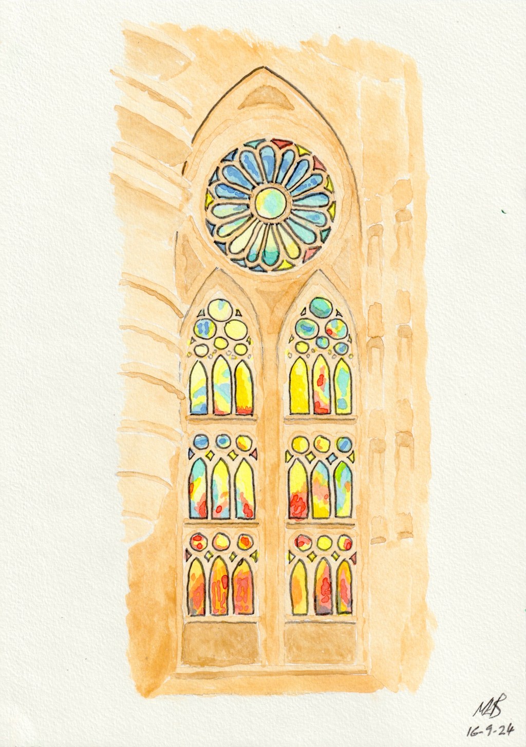
I can’t quite decide whether this painting is okay or not! On the one hand it definitely doesn’t capture the vibrant colours in the glass that my eyes saw at the time and that my camera captured for posterity. On the other hand, it is quite a pleasant picture to look at, and it does still capture some of the liveliness of the colours in the window.
Prior to adding the colour of the windows to the painting, the stonework – in various shades of yellow ochre – did actually look quite good. However, the tone of the stone is too light to provide the necessary contrast to the bright window colours – I’ll know for next time I guess!. In the end I decided that the only remedy to this was to outline the windows and the arches, which looks rather artificial but does restore some necessary shape to the image.

Leave a comment